SchoolBlocks creates a home for the vast amount of information on education websites, while establishing a stronger sense of organization in the process. The information schools provide to parents, students, and other educators is vital. If no one can find it, it's useless. SchoolBlocks makes it easier for people to find what they need, quickly.
Schools have nearly the same demographic profile as the Pinterest userbase. Approximately 80% of Pinterest users are women while 76% of educators are women. In addition, the mom typically takes a larger role in a child's education. Pinterest represents the leading edge of user experience design. They've created an engaging and fun user experience through the integration of billions of content items. Why can't we achieve the same phenomena with school websites?
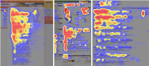
Studies that have demonstrated the "F-Shaped" pattern for reading web content. (Source: NN/G). Similar to a book, our eyes move from left to right, even when navigation and other important elements are found in vertical lists and headers. If your website has a lot of vertical-based content layouts, than it might not be consumed by your community even though it looks pretty!
SchoolBlocks uses the proper ratio between Navigation & Browsing
Accommodating both "Navigating" & "Browsing" behaviors while establishing a sense of organization and professionalism is why SchoolBlocks looks different than the rest. The navigation (and search) system serves quite a different user experience than our browsing behaviour. Our navigation items offer both efficient drill-down methodology while leveraging larger text formats, icons and descriptions. Our browsing experience offers content that is interesting, engaging and efficient to consume. Our blocks aren't just snippets of content. Our blocks are interactive and customized to the user visiting the site.
The Challenge and Benefits of "Clean and Simple"
SchoolBlocks loves mascots and school colors as much as anyone. The careful application of those is core to design success. By 'careful' we mean to add those design elements without sacrificing mobile and tablet experiences.